UI Case Study — a Car Rent Management Web App

Hi everyone! This time, I’m going to share my design process of making a wondrous car rental web-based app design. This is definitely a UI case study because the wireframe is already exist and I challenged to make the high-fidelity version of the homepage menu. There’s also couple of requirements for the goal of the app and the user who use it.
So, here are the hints.
Goal
The car rental company want to expand their business. So, they need a tool to track, control, and manage their fleet.
User
1. Mostly 25–45 years old male
2. Own or manage (as admin) a car rental company
3. Digitally literate, currently able to do basic fleet management with Microsoft Excel
Wireframe

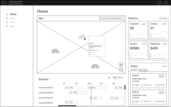
This is the replica of the given wireframe. The original image cannot be included because it is the property of the authorized party.
There are missing parts on the sidebar menu that not mentioned on the requirement given. So, I have to figure it out by myself.
User Persona
To help me do the design process, I make a user persona based on information of the user and the goal above to make this project looks more real.

This user persona will be useful to help me determine what features/menus are needed in the sidebar menu to help the management process.
What’s on sidebar menu?
So, this is several menus I think might be helpful to support the management activity of a car rental company regarding the user persona’s data.
There are some special menus and general menus including in this sidebar menu.
Special Menus
· Home
This menu would help user to control and track the rental activity of the customer. This menu would show a glint information from the other menus, so user could just watch the overall activity in brief from this menu.
· Reservation
This menu would help user to book and manage the order in and all the transactions from the customers. This feature would also let the admin knows if there are customers who return to place an order for car rental at their company, how many times they place an order, etc.
· Customer Data
This menu would help user to book the required data of the customers to make it easier for them to contact customers when something happens. If the company have such a marketing strategy, this feature would also helpful to build a good relationship with the royal customers.
· Car Status
This menu would help user to check out the car status like booked, in use, in repair, and available. The car status would also conduct the detail information of a car that might necessary for certain request of the customers.
· Calculation
This menu would help user to collect all the transaction data to be calculated. The admin will get the calculated data based on the preferred time and the data could also be compared automatically. This feature also conducts the statistics raw data, measurement detail and the processed one from customer, orders, income, and expenses.
General Menus
· Setting
This menu would help user to manage the setting of the app.
· Help
This menu would help user if there’s something wrong with the system.
Style Guide
After completing the missing parts, then I made the style guide according to the design item guide in the wireframe, determined the colors, fonts, and created the required icons.
Considering all the requirements on the user persona, I’m going to make a simple yet elegant design which has a white dominant part and blue with a little touch of other colors that make the design looks more captivating.

High-fidelity Interface

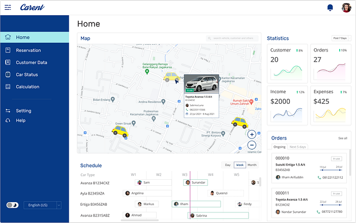
This is the high-fidelity interface I designed based on all the concept and materials that hopefully meet the user needs.
I also added display mode and language preference as accessible features in the bottom of sidebar menu to improve the accessibility of the web app.
That’s all for this UI case study.
